- Research
- Open access
- Published:
A new method of identifying key industries: a principal component analysis
Journal of Economic Structures volume 11, Article number: 2 (2022)
Abstract
This article using the principal components analysis identifies key industries and groups them into particular clusters. The data come from the US benchmark input–output tables of the years 2002, 2007, 2012 and the most recently published input–output table of the year 2019. We observe some intertemporal switches of industries both between and within the top clusters. The findings further suggest that structural change is a slow-moving process and it takes time for some industries to move from one cluster to the other. This information may be proved important in the designation of effective economic policies by targeting key industries and also for the stability properties of the economic system.
1 Introduction
In this article, we apply dimensionality reduction to three benchmark input–output tables of the USA of the years 2002, 2007 and 2012 as well as the last available input–output table, as of this writing, of the year 2019. The dimensions of the tables are reduced to 70 × 70, as we have eliminated the industry housing because of its many imputations, and also the fictitious household industry. The idea of dimensionality reduction, that is, the way to reduce the complexity in the modeling of an economy can be traced in the writings of the Physiocrats and their tableau économique, whose purpose was to mimic the operation of the entire economy by compressing it into three sectors. We do know that the tableau is essentially the prototype of a one (multipurpose) commodity world. A similar idea can be recognized in Ricardo’s corn model and certainly in Marx’s schemes of simple reproduction, where a single commodity functions both as a consumer and an investment good. This dual property of the commodity is derived from the uniform capital intensity of the two sectors (departments) of the economy. A similar idea could be identified in Samuelson’s (1962) parable production function also based on the production of a single commodity. Finally, in recent economic growth theory, we increasingly observe the case of models of a one-commodity world.
In the works (Mariolis and Tsoulfidis 2018, Tsoulfidis 2021 and 2022) there has been an effort to stripe down the behavior of the entire economic system and compress it into a single hyper-industry through the application of the Schur and singular value decomposition (SVD) techniques (Meyer 2002, ch. 5). The rationale for the application of these techniques is the skew distribution of the economic system’s eigenvalues and the wide gap of the second from the maximal. The exponential falling pattern of the subdominant eigenvalues ensures that their effect on the economy is minimal and, therefore, for all practical purposes can be side-stepped. Similarly, using the principal components analysis (PCA), we separate the impact of the top two (at most three) eigenvalues, which is equivalent to saying that the movement of prices induced by changes in the rate of profit is curvilinear and the same is true with the wage rate of profit curves or what is the same factor price frontier. Such findings suggest that the distribution of eigenvalues is mainly responsible for the shape of the price–profit or wage–profit curves and that the first eigenvalue along with the second compress most of the information regulating the economic system’s motion leaving not much to be explained by the third or fourth eigenvalues (see Tsoulfidis 2021, ch. 6 and 2022).
The remainder of the article continues as follows: Sect. 2 gives a brief description of the fundamentals of the PCA and its use in determining clusters in the economy. Subsequently it applies the PCA and contrasts the first principal component against the backward linkages of the industries. The k-means clustering technique is used to extract the optimal number of groups of industries followed by the Silhouette method to form the clusters of industries. Sect. 3 orders each of the industries in the form of a dendrogram and respective network. Finally, Sect. 4 summarizes and concludes with remarks about future directions of the research.
2 Methods and results
2.1 Dimensionality reduction through principal components analysis
PCA is an effective dimensionality reduction technique that constructs relevant features through linear combinations of the original features. The construction of relevant features is carried out by linearly transforming correlated variables into fewer uncorrelated variables. This transformation becomes possible through the projection of the initial data into the reduced PCA space using the eigenvectors of the covariance/correlation matrix, or what is the same, the principal components (PCs). The resulting projected data comprise essentially linear combinations of the initial data capturing most, if not all, of the variance in the data. Furthermore, the PCA increases interpretability and, in so doing, can become particularly helpful in dealing with economic datasets. Notwithstanding its great advantages, the PCA has not been used in economics or in input–output analysis in any extensive way. The usual economic applications of the PCA are in questions in finance (e.g., Plerou et al. 2002; Farné and Vouldis 2021), in economic geography and regional analysis mainly in determining clusters of industries and agglomeration economies (e.g., Vom Hofe and Bhatta 2007; Ramos and Moreno 2013).
The advantages of the PCA render it particularly applicable in input–output data in the direction of identifying the relative importance of industries in the operation of the economy. From the estimated PCs, the dimensionality reduction requires just the top two. Experience has repeatedly shown that the top two eigenvalues compress most of the influence or what is the same most of the variance contained in the economic system’s input–output data. A third or a fourth PC could also be included in the case the first two PC are inadequate. However, by adding more PCs the model gains very little in accuracy, but loses a lot from its parsimonious character, and therefore, its analytical strength progressively fades away. In dealing with the available input–output matrices and their eigendecomposition, we have repeatedly found that the linear and, at most, quadratic approximations are adequate to mimic the actual movement of prices induced by changes in income distribution. The eigendecomposition's remaining terms, although many, nevertheless contain minuscule information, and therefore, we can dispense with them (see Bienenfeld 1988; Iliadi et al. 2014; Mariolis and Tsoulfidis 2018; Tsoulfidis 2021, ch. 6 and 2022). The application of the PC analysis in input–output data consists of the following main operational steps:
2.2 Step 1
Starting with the matrix of direct input requirements or Leontief inverse provided by the U.S. Bureau of Economic Analysis (BEA) for the benchmark years, that is, the matrix of total requirements or Leontief inverse \(\left[ {{\mathbf{I}} - {\mathbf{A}}} \right]^{ - 1}\), we estimate the input–output matrix,\({\mathbf{A}}\), as follows:
From which in turn, we get the vertically integrated input–output coefficients,
and so, we end up with the matrix \({\mathbf{H}}\) of 70 × 70 industries, whose PCs we seek to estimate in the effort to group industries into clusters with differences in relative importance and meaning. The advantage of the matrix \({\mathbf{H}}\) is that it gives more (less) weight to the larger (smaller) coefficients in matrix \({\mathbf{A}}\).Footnote 1 Furthermore, the matrix \({\mathbf{H}}\) is used in the estimation of prices and their changes in the face of income redistribution (Tsoulfidis 2021, ch. 6 and the literature cited there).
2.3 Step 2
We centered the matrix \({\mathbf{H}}\), by subtracting from each column element the column’s mean, and we repeat the process for each of our 70 industries and get
where \({\mathbf{e}}\) is the row (1 × 70) vector of ones or simply the summation vector and a prime indicates the transpose of a vector or matrix. In order to find the variance/covariance matrix, we multiply \({\overline{\mathbf{H}}}\) from the left by \({\overline{\mathbf{H}}}^{\prime}\) and form the new matrix
The eigenvalues of the above variance/covariance matrix ranked from the maximum to minimum along with their respective eigenvectors. It is important to note that the eigenvalues of the matrix \({\overline{\mathbf{H}}}^{^{\prime}} {\overline{\mathbf{H}}}/69\), the maximal eigenvalue stands for the maximal variance and so forth for the rest.
2.4 Step 3
We know that the eigenvalues denote the relative importance of their corresponding eigenvectors. It follows, therefore, that the ratio of each of the eigenvalues relative to their total sum gives the proportion of variance explained. From the estimated eigenvalues, we isolate the first couple, whose percentage in the total is found quite satisfactory. This requirement has indicated that with the first two eigenvalues, despite their relatively low percentage, they provide a pretty accurate description of the motion of the entire economic system. Consequently, by adding the next in ranking eigenvalues, we do not improve in any significant way our overall understanding of the relative importance and interconnections of industries. The eigenvectors indicate both the size and the direction of the variance and they are ranked according to their respective eigenvalues starting with the maximal going to the second, third, and so forth. We rotate the eigenvectors such that to place the first PC on the horizontal axis and the second PC on the vertical axis.
Figuratively speaking, and in case of two PCs, we may think of the first PC as the orthogonal that one gets from the vertical intersection of a cylinder, provided that its height is by far higher than its periphery. The second PC is a horizontal intersection of the same cylinder perpendicular to the orthogonal. The variance equated with the height of the first PC is meaningful only if it is significantly larger than the second PC and both are distant enough from the rest. In our data, a third PC will give rise to a three-dimensional graph, but this would not add much in our denoising process and the extraction the relative importance of each of our 70 industries. The PCA seeks to maximize, to the extent possible, the information content in the first PC, the remaining information is in the second PC and so forth. The scree plot, that is, the distribution of eigenvalues of the matrix \({\overline{\mathbf{H}}}^{^{\prime}} {\overline{\mathbf{H}}}/69\), signifies the relative importance of each of the PC.
2.5 Step 4
Having selected the first two eigenvalues of the variance/covariance matrix \({\overline{\mathbf{H}}}^{^{\prime}} {\overline{\mathbf{H}}}/69\) and respective eigenvectors or rather feature vectors discarding those of lesser significance (of lower than the second eigenvalues), and form with the remaining ones a matrix of vectors that we call feature vectors. In short, the feature vector is simply a matrix whose columns are the eigenvectors of the components that we decide to utilize.
This makes it the first step towards dimensionality reduction, because if we choose to keep only the first two eigenvectors (components) out of 70, the final data set will have only 70 × 2 dimensions. Subsequently, for the derivation of PC we apply the following multiplication
And we end up with the \(\overline{{{\mathbf{PC}}}}\) of the economic system’s matrices from which we keep the eigenvectors corresponding to the top two eigenvalues.
2.6 Principal components and clusters of industries with input–output data
Before we introduce the PCA and its application in identifying key industries in the input–output structure of the economy, it is important to establish its connection and relation in general with what has been hitherto used in input–output analysis. For this purpose, we start with the Leontief inverse, which is directly given in the input–output tables of the BEA and make a comparison between the estimated first PC and the estimates of linkages, backward or forward. From the examination of the simple additions of columns or rows of total requirement matrices of the benchmark years 2002, 2007, 2012 and also 2019, the last input–output data available, we find as expected that the simple row sum of \(\left[ {{\mathbf{I}} - {\mathbf{A}}} \right]^{ - 1}\) has a low correlation with the estimated first PC of the matrix \({\mathbf{H}}\). By contrast the column sums or the column norms of the matrix \(\left[ {{\mathbf{I}} - {\mathbf{A}}} \right]^{ - 1}\) are closely associated with the first PC.
It is important to emphasize at this juncture that the forward linkages (FL) or backward linkages (BL) of industries of matrices have the exact same ranking regardless of the use of matrix \(\left[ {{\mathbf{I}} - {\mathbf{A}}} \right]^{ - 1}\) or the vertically integrating technical coefficients matrix \({\mathbf{H}}\), which is used for the estimation of our PC. We opted that for the estimation of PC to utilize the matrix \({\mathbf{H}}\) which has been utilized in the estimation of relative prices as well as the price and wage rate of profit curves (Tsoulfidis 2021). The estimated first PC from the above matrix is found to be highly correlated with the direct (unweighted) BL of the total requirement \(\left( {{\mathbf{e}}\left[ {{\mathbf{I}} - {\mathbf{A}}} \right]^{ - 1} } \right)^{^{\prime}} /70\), where \({\mathbf{e}}\) is the row (1 × 70) summation vector of ones, the so derived industry average BL was further divided by the economy’s average BL (Chenery and Watanabe 1958; Miller and Blair 2009, ch.12). If an industry’s linkages are higher than one, it follows that this industry weighs more than the economy-wide average. Consequently, changes in this particular industry exert higher than average effects on the total economy, the converse holds for those with less than one.
The first PC corresponding to the eigenvector with the maximal eigenvalue provides us with information as to where the data are maximally spread out and, therefore, explains the most variance of the system. The second PC has a lower eigenvalue and thus encompasses most of the system’s remaining variance. The skew distribution of eigenvalues allows the selection of the top two eigenvalues, which although they account for nearly 50% of the total variance; nevertheless, are adequate since we are dealing with too many (70 × 70) observations.
The idea is that an industry with a high power of dispersion (variance) concentrates the features of a key industry. This is equivalent to saying that a given percentage increase in its output will deliver a significant impact on its suppliers. By contrast, in an industry with relatively small variance, a change in its output draws evenly and lightly on its suppliers.Footnote 2
It is also important to note that we did not get an equally strong relationship between the principal components of the matrix \({\mathbf{H}}\) and the FL. The idea is that for the sum of rows, we refer to output proportions and so a closer relationship would require estimation of \(\overline{{{\mathbf{PC}}}}\) from the matrix \({\mathbf{H^{\prime}}} = \left[ {{\mathbf{I}} - {\mathbf{A}}} \right]^{ - 1} {\mathbf{A}}\). This does not mean that the FL are not important in the understanding of interrelationships between industries and the structural changes in the economic system as a whole. For this purpose, neither the first PC is adequate, and needs to be supplemented by the second, at least, PC.
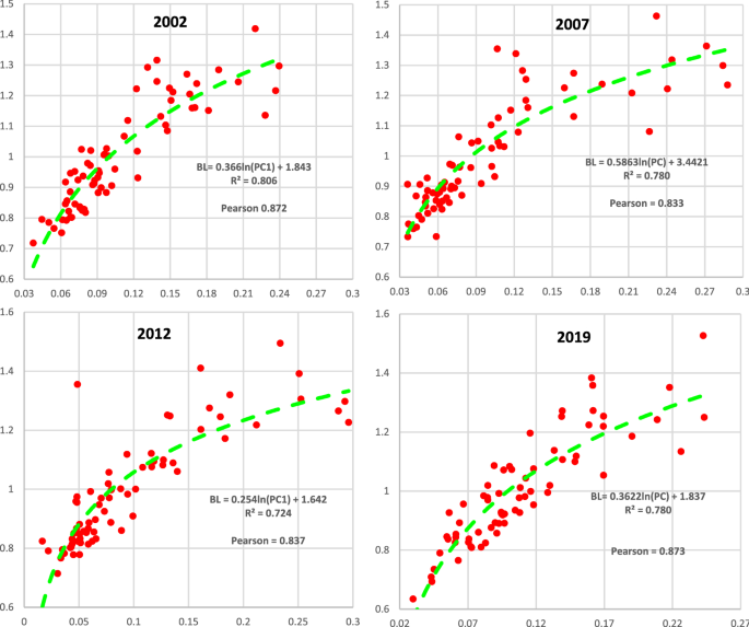
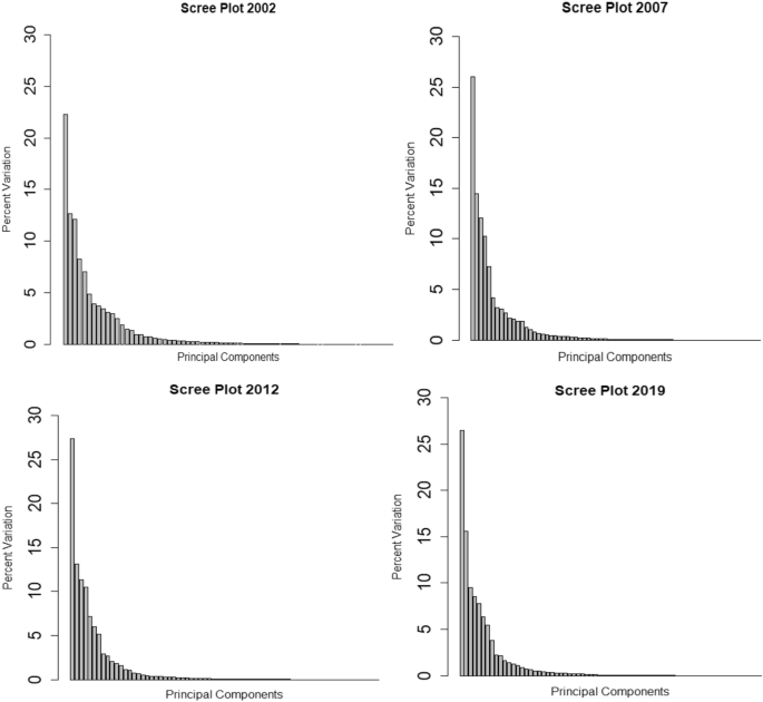
From the panel of four graphs (Fig. 1), we observe that the first PC is strongly associated with the BL of each industry, as this is reflected in the high R-square, which varies from 72 to 80%. The Pearson correlation coefficient (displayed in each of the panel of four graphs in Fig. 1), which is well above 0.80 indicates a strong similarity and positive relationship between the two in comparison variables, in each year of our study. These findings suggest that the application of the PCA may lead to fuller and more informative results with respect to the interrelations of industries. Furthermore, since we are looking for higher variances, it becomes particularly operational in evaluating the relative importance of each industry, as one may judge by the covariance of the central array and then find the eigenvalue and eigenvectors of the covariance. The dominant eigenvalue explains most of the variance in the data and the second along the subdominant eigenvalues ranked from the top down are used to categorize each industry to appropriate cluster as shown below. The covariance matrix \({\overline{\mathbf{H}}}^{^{\prime}} {\overline{\mathbf{H}}}/69\) gave the following eigenvalues for each of the four years of our study, which we plot in a panel of scree graphs in Fig. 2.
In spectral methods, the top very few eigenvalues decide on the dimensions or, what is the same, the number of PC to be selected depending on the so-called “elbow rule”, according to which the usually selected percentage explained by the PC should be around 70%. However, when we are dealing with large dimensions, as in our case, this percentage might be significantly lower. From the panel of four scree graphs in Fig. 2, we observe that the first two (or at most three) eigenvalues are much higher than the rest and from the third eigenvalue onwards starts the decaying of eigenvalues. By adding the subdominant eigenvalues and the associated with these eigenvectors, we do not improve our overall explanation or variability, and certainly, we do not affect qualitatively our results.
2.7 Identifying industry clusters
In data science and especially in datasets with many features (or variables) such as in our case, clustering is a very useful tool. The greatest dissimilarity between different clusters and most important the greatest similarity within the same cluster, is the method for finding cluster structure in a dataset. The earliest method used mainly by biologists and social scientists is the hierarchical clustering, setting cluster analysis as a branch of multivariate statistical analysis (Jain and Dubes 1988; Kaufman and Rousseeuw 1990). This approach to machine learning is also called unsupervised because unlike supervised learning where the data or inputs are placed in already known categories (fruits are classified in apples and oranges) as well as separating the dependent from independent variables. By contrast, in the unsupervised learning the algorithms are left to their own devises to detect the presence of similarities and extract patterns between the inputs so that similar inputs can be clustered together.
These clustering methods, from a statistical viewpoint, generally are considered as probability and non-parametric model-based approaches. The first approach follow that the observations are from a mixture probability model with the consequence to use a mixture likelihood approach to clustering (McLachlan and Basford 1988). The Expectation and Maximization (EM) algorithm is the most frequently used in model-based approaches (Yu et al. 2018). The use of an objective function of similarity or dissimilarity measure is the preferred method for clustering in a non-parametric approach, with the division into hierarchical and partitional methods in nearly every case (Kaufman and Rousseeuw 1990; Jain 2010; Yang et al. 2018).
On the other hand, the main problem of these k-means clustering algorithms is the need to give a number of clusters a priori. For solving this, validity indices supposed to be independent of clustering algorithms should be used (Halkidi et al. 2001). Many of these validity indices had been proposed such as Bayesian Information Criterion (BIC), Kass and Raftery 1995; Akaike information criterion (AIC), Bozdogan 1987; Silhouette width (SW), Rousseeuw 1987, among others.
How similar an object is to its own cluster (cohesion) compared to other clusters (separation) is a very useful measure obtained by the Silhouette value (Rousseeuw 1987) that we use in our approach in deriving the key industries of the US economy in 4 years quite apart from each other. This measure ranges from − 1 to + 1 with higher values better match to its own cluster, whereas low indicate poorly matched values to neighboring clusters (Sinaga and Young 2020).
Finite cluster prototypes with their own objective functions can represent the various partition methods. Furthermore, the dissimilarity (or distance) between a point and a cluster prototype is crucial for the partition methods (Jain and Dubes 1988). The method of k-means clustering with various extensions is very popular in the literature with application in various scientific areas (Alhawarat and Hegazi 2018).
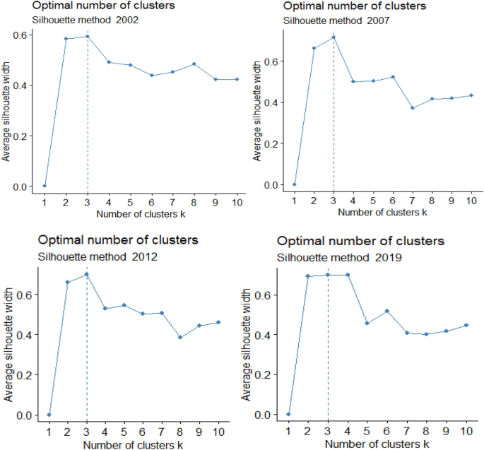
The next step is to separate our 70 industries into distinct clusters according to their similarity or, what is the same, their homogeneity. The similarity or dissimilarity of the industries depends on the question asked and the type of industries and in our case, the relevant question is the ranking of our industries in order of importance; namely, not all industries impart or incur the internally or externally generated shocks in the same way. Some industries are tightly connected to each other but weakly to others and others are only lightly connected with others. In our case, we categorized the 70 industries into three clusters according to the popular k-means criterion. The latter is a method of partitioning n observations into k clusters in which each industry is assigned to a particular cluster according to the nearest mean or cluster centroid around which industries are crowded. The property of k-means clustering is that it minimizes within-cluster variances or Euclidean distances. The mean optimizes squared errors, whereas the geometric mean minimizes Euclidean distances. Cluster analysis starts by selecting a distance measure and optimization process which meaningfully determines the number of k partitions or clusters (only a few) and the industries contained in each. In Fig. 3, we determine the optimal number of clusters following the Silhouette method for each of our four years of the analysis. The results show that in every particular year the optimal number of clusters is three.
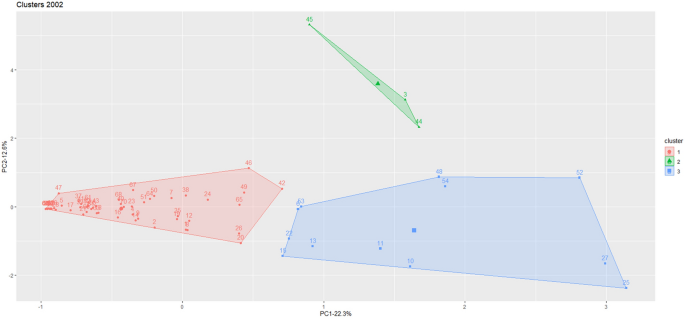
Having established that the number of clusters is three, the industries are classified in each of these three clusters according to their respective centroid. The scree plot helps us to choose the principal components and understand the basic data structure. In Figs. 4, 5, 6 and 7, we display the three distinct clusters and the number of industries contained in each.
In the interest of brevity and clarity of presentation, we explain for each of the four years of our analysis the clusters that we form as well as the industries they include. As we have already mentioned the first PC is placed on the horizontal axis and the second PC on the vertical axis. From the three clusters, we separate the blue or the South–East (S–E) cluster and the green or the North–East (N–E) cluster as the most important ones containing the key industries. The ranking in each particular cluster is according to the first PC and also take into account the second PC. The majority of industries are compressed in the orange or Western (W) cluster. The nomenclature of industries is in the Appendix 1.Footnote 3 Thus, the benchmark input–output data of the year 2002 are as given in Fig. 4.
In Fig. 4, the industries in the S–E (blue) and N–E (green) clusters are ranked starting from the South–East (S–E) and placing industries from the right going to the left until we exhaust the industries in the S–E cluster and then continue with the N–E cluster. Thus, we have the following ranking noting first the number of the industry and then its name. Thus, we have 25 chemical products, 27 wholesale trade, 52 miscellaneous professional scientific, 54 administrative and support services, 48 other real estate, 10 primary metals, 11 fabricated metal products, 13 computer and electronic products, 53 management of companies and enterprises, 6 utilities, 22 paper products, 15 motor vehicles bodies and trailers. Thirteen industries in total are included in the first cluster while the second paint in green cluster N–E cluster contains the following three industries: 44 Federal credit intermediation, 3 Oil and gas extraction, 45 Securities commodity contracts.Footnote 4
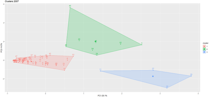
Continuing with the benchmark year 2007, we distinguish the following three clusters shown in Fig. 5.
We observe that the number of industries in the blue or S–E cluster decreased and increased in the about North–East (green) cluster. More specifically, in dissenting order and starting from the right end of the first PC, we have the following four industries: 25 chemical products, 10 primary metals, 27 wholesale trade, 11 fabricated metal products. While the NE cluster includes more industries, which are also ranked in dissenting order, and these are: 3 oil and gas extraction, 52 miscellaneous professional scientific and technical services, 24 petroleum and coal products, 48 other real estate, 54 administrative and support services, 44 federal credit intermediation, 45 securities commodity contracts, 46 insurance carriers and related activities.
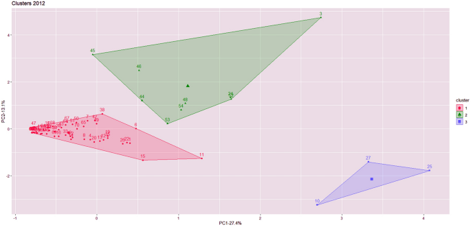
Continuing with the benchmark year 2012 the three clusters along with the industries contained in each are displayed in Fig. 6.
We observe that in the year 2012 the number of industries in the top South–East cluster dropped to only three and these are: 25 chemical products, 27 wholesale trade, 10 primary metals.
The North-East cluster includes the following industries ranked in dissenting order: 3 oil and gas extraction, 52 miscellaneous professional, scientific and technical services, 24 petroleum and coal products, 48 other real estate, 54 administrative and support services, 53 management of companies and enterprises, 44 federal credit intermediation, 46 insurance carriers and related activities, 45 securities, commodity contracts, etc.
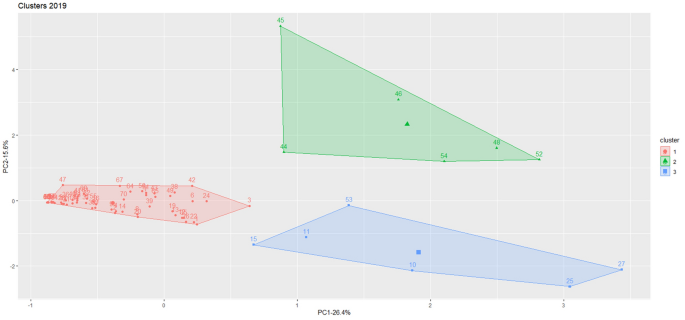
Finally, the lack of a benchmark input–output table for the year 2017, which is still in its making, we utilize the last available input–output table is for the year 2019 and the three clusters are shown in Fig. 7.
The blue or S-E cluster of the year 2019 is augmented to include besides the three top industries of 2012 (27 Wholesale trade, 25 Chemical products, 10 Primary metals), which are to the right end of the cluster and so continue to exert most of their influence on the economy and three more industries are added; namely, 53 management of companies and enterprises, 11 fabricated metal products, 15 motor vehicles, bodies and trailers.
By contrast the green or N-E cluster contains the following industries: 52 miscellaneous professional, scientific and technical services, 48 other real estate, 54 administrative and support services, 46 insurance carriers and related activities, 45 securities, commodity contracts and 44 federal credit intermediations.
3 Discussion
3.1 Ranking of industries
The clustering of industries into three groups alerts us into an altogether different vantage point of view. Hence, the grouping of industries into particular clusters ranked in order of importance makes possible the estimation of the impact of internally or externally generated shocks in the totality of the economy. For this purpose, we compare our findings from the PCA with those of total BL and FL. In effect, we experimented with the traditional techniques of identifying key industries according to the forward or BL. The results showed that neither the forward, nor the BL, taken individually, accord to the ranking of industries found through the clustering procedure. However, by taking the total linkages, that is, the average of an industry’s forward and BL, the resulting ranking is quite like that of the PCA.Footnote 5 Thereby, lending support to our clustering technique as a meaningful and, at the same time, effective way of ranking industries.
The next task is to group industries into particular clusters according to how homogenous they are. The common property characterizing industries is their variance which can be classified into high, medium, and low. This clustering would make a fine example of “unsupervised learning” since we are not making predictions; we merely categorize the industries into particular groups. There is no doubt that the PCA captures better than any other parsimonious method the variance associated with each of the industries. Furthermore, the PCA enables the classification of industries according to their positive distance from zero. In particular, the further away from zero, the higher, the variance of the industry from the rest, and other similarly situated industries can be grouped forming a cluster. The location of the industry into a particular cluster indicates its association with respect to the two PC. Thus in our case, the industries grouped in the S–E cluster are characterized by high variance and therefore have a much larger effect on the economy. The second in importance N–E area, although it contains influential industries, nevertheless, they are less so, than those in the S–E. The majority of industries are crowded near zero and they are far to be considered key industries.
It is interesting to note that the ranking using the average of both BL and FL is quite close to that of the PCA. The underlying idea behind the total linkages is that if higher than one, it follows that the importance of this particular industry exceeds that of the economy-wide average. The converse is in case that this figure is lower than one. We picked 1.18 as our threshold for total linkages. We found that about 15 are the key industries, in the 4 years of our study, which are no different than those derived by our two clusters. Of course, we have differences in rankings, but the clustering method based on PCA gives consistent results from one benchmark year to the next and the last 2019 year. The PCA results are close to those derived using the traditional total linkages. Furthermore, the PCA possesses some additional properties that may give rise to a new research agenda and methodology in identifying clusters of industries and their possible economic impact.
An inspection of the three clusters reveals that the outer right cluster is the one whose relative importance makes it the principal cluster. Thus, the industries in the S–E, other things equal, are more influential than similarly situated industries located in the N-E cluster. The rankings of industries according to the PCA are displayed in Table 1. More specifically and for each of our 4 years, the first column displays the ranking of industries. The second column shows the industry number placed according to the traditional method. In the third column, we show the industry number contained in each cluster starting from the S–E and continuing to N–E and going to the W cluster until the 15th industry. There is variability between industries but not much.
3.2 Industries ordered in dendrograms
A salient feature of the PCA is that clustering enables the presentation of the industries in a dendrogram, which marks the last step in cluster analysis. A dendrogram is a hierarchical tree plot that displays a grouping of industries into distinct clusters. The length of each branch on the graph measures the distance between industries in the cluster. The purpose of dendrograms is to decide upon the suitable number of clusters. For this purpose, we employ the agglomerative method, which creates a hierarchy of industries starting with all of them as if they were completely separated and then fuses them until there is only one cluster left.
The dendrograms below mark the presence of three clusters. The clusters are distinguished starting from the horizontal axis, where all 70 industries stand like the leaves of the tree. As we move upward, ideally drawing a parallel line to the hypothetical horizontal axis, we start distinguishing the branches directed to the core of the imaginary tree. In this process, we end up with three main branches for each year of our study, exactly as indicated by our k-means testing procedure. In each of these branches, we identify not only the tree clusters but also their detailed connections. We observe a hierarchical location of the industries ranked according to the height of the branches. The higher a branch, the higher the relative importance of the industry.
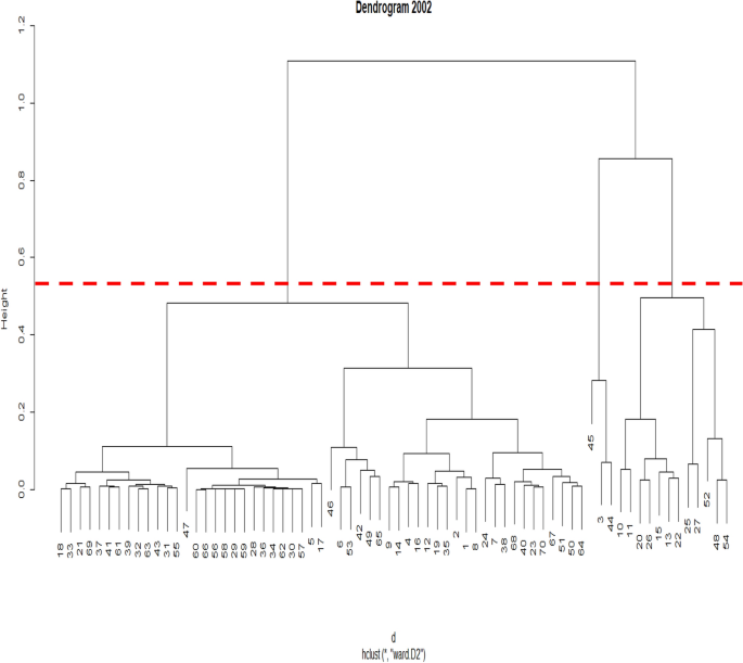
The nodes that are higher indicate the importance of each cluster and within the same cluster the importance of the industry. In other words the longer the branch the more important the industries that branch out of it. And from each branch the industries located above the others carry more weight than those being below it. Thus starting from the benchmark year 2002 the dashed horizontal in red line indicates the presence of three clusters and the top one consists in dissenting order of industries (45, 3 and 44), which make up the first main branch. Going to the next in importance branch the industries 52, 48, 54 industries 25, 27 follow 15, 13, 22 and so forth. This ordering maybe in some deviation from that of clustering and displayed in Table 1, but certainly the dendrogram pretty much makes the same selection with that of the Silhouette method of clustering and differences are border cases.
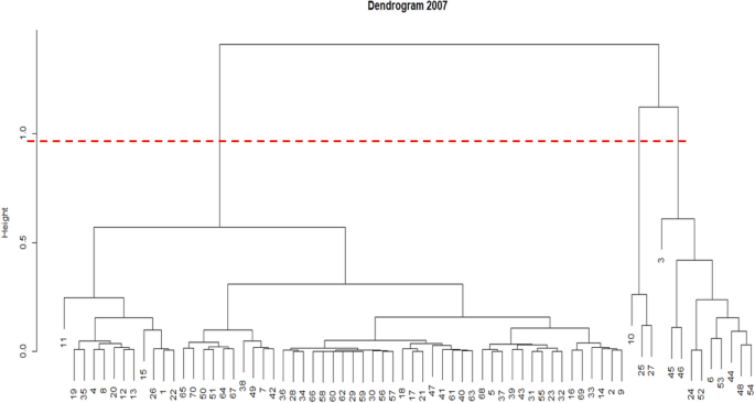
In the dendrogram of the year 2007, we have the following ranking in descending order 10, 25, 27 from the first major branch and for the second 3, 45, 46, 24, 25, 44, 6, 53, 48 and 54.
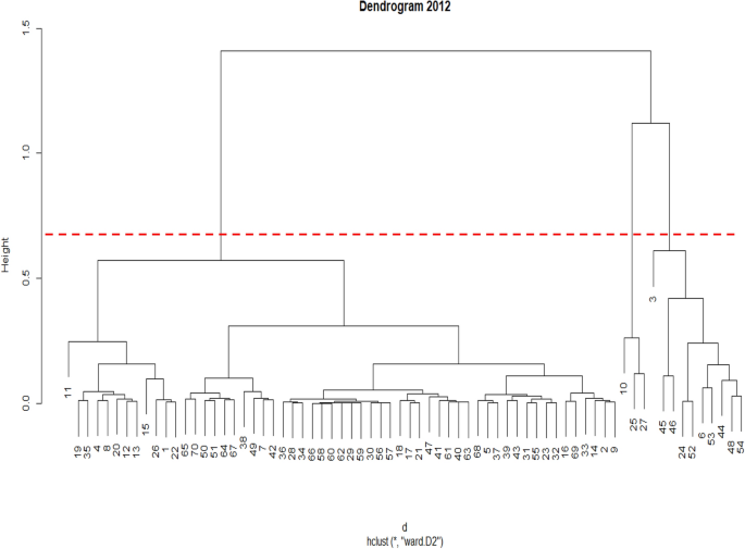
The same ranking with respect to the top longer branch is repeated in the dendrogram of the year 2012. Thus, we have industries once again 10, 25, 27 followed by 3, 45, 46, 24, 25, 6, 53, 44, 48 and 54.
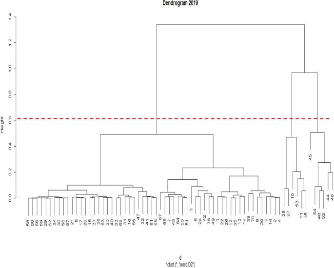
Finally, the dendrogram of the year 2019 gives the following ranking of industries 25, 27, 10, 53, 11, 15, 45, 44, 46, 54, 48, 52. In the four dendrograms that we constructed, we observe that industries 10, 25 and 27 are connected to each other and are distinct from the other industries and are ranked in the top industries for the last three input–output data.
Dendrograms may be proved particularly helpful in our understanding of the formation and the internal structure of clusters, and they can be profitably used in laying bare underlying trends and highlighting outliers. Such information is unquestionably practical in tracking down the process of structural change and technological change. For this purpose, the more informed inter-cluster and intra-cluster connections of industries shed more light on all of the above. The panel of four dendrograms displayed in Fig. 5 provides us with a visual description of such inter- and intra-cluster connections of industries.
A similar picture is drawn by looking at the particular networks consisting of industries displayed in a panel of four graphs in Fig. 5. We observe that industries form clusters which we paint in green, blue, and red colors to be distinguished from each other. In these networks, we identify the connections between industries within each of the three clusters and their branching out. The latter indicates more clearly the interconnections between industries, which may prove invaluable in picking strategic industries to become the targets of particular industrial policies.
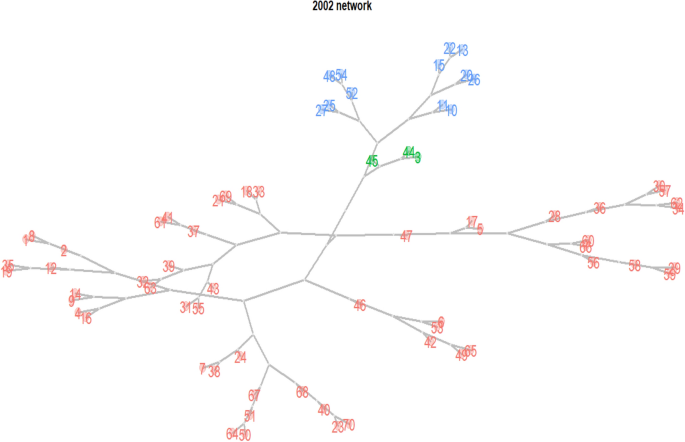
In the above 2002 network the green branch has a superiority over the blue and the red branches. Industry 45 in the green branch appears to be the most important followed by industries 44 and 3. The second in importance blue branch has as its top industries 27, 25, 11, 10 and 52. Finally from the red branch of our dendrogram we distinguish in order of importance industries 47 and 46 against all others remaining industries.
The usefulness of this graphic is that we can see clearly as branches and leaves all the connections between industries and the precedence or priority of certain industries over others.
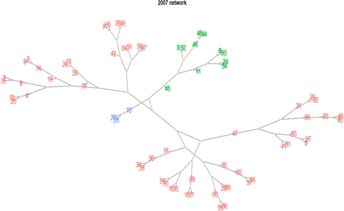
In the above network in the blue branch 10 has the priority over 25 and 27. In the green branch industry 45 is the most influential followed by industries 11, 3, 52 and so forth. On the other hand the red one has the priority of 17, 15 and 47 over all others.
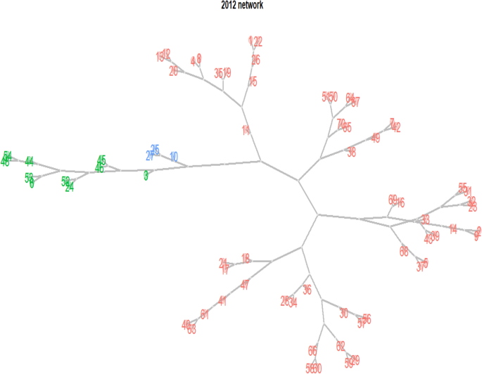
In the 2012 network the blue branch the priority is in the industry 10, the green has the number 3 following by 45 and 46, and the red one number 11 following by numbers 15, 18 and 36.

Finally in the 2019 network we observe in the blue branch the priority of number 10 industry, in the number 3 over 45 and 46 has the priority, and in the red one numbers 11, 36, 18 and 38 over all the remaining industries.
4 Concluding remarks
In evaluating the key industries grouped into clusters and basic economic structures, the PCA possesses distinct advantages compared to the standard BL and FL methods. The PCA, a mathematically rigorous and parsimonious technique, enables the more efficient utilization of input–output data. As a result, the PCA besides the ranking of industries, as in the standard linkages methods, further refines this ranking by placing the industries into distinct and well-defined clusters. In so doing, the PCA expands the identification of key industries in new directions. Thus, starting with clusters and going into dendrograms and networks, we identify the relative importance of industries and their connections with each other within the same cluster.
In experimenting with the data from our four input–output tables of the US economy, we observed a close association between the leading PCs and the total linkages of industries. A result that encourages the use of the PCA and its application to input–output data for the identification of key industries. The next step was to use the top two PCs perpendicular to each other, meaning their correlation is zero. We have also utilized these two PCs as the horizontal and vertical axis, respectively. In such representation, we grouped the data into three particular clusters for each of the four distant years of our study. The clustering of industries was based on the k-means and Silhouette procedures. It is interesting to note that the top two clusters include nearly the same industries over the years and, the very few that are not included stand as border cases. Moreover, the industries in the top two clusters do not differ from those derived from the backward and forward linkages. The salient feature of the PCA is the grouping of industries into clusters and dendrograms. The presentation of networks reveals the interlinkages between industries within clusters and the hierarchical positions of clusters and their interconnections. Future research efforts should focus on the application of the above techniques on input–output data from many countries and years. In this respect, the more industry-detailed input–output data would enhance our understanding of the interconnections of industries and changes in the structure of the economies. Such information is extremely useful in the planning of an effective industrial policy.
Availability of data and materials
The datasets for the present study are available electronically and publicly. Data on input–output tables are available from the website of the BEA.
Notes
The Leontief inverse of the input–output matrix accounts for both the direct and indirect interindustry linkages. The data were downloaded in March 2021.
In the literature there are various ways to weigh the relative importance of each industry, for example, relative industries’ shares in final demand or total output instead of unweighted measures as the one we used. However, we do not expect any qualitative differences in our results (see Miller and Blair 2009, ch. 12).
The clusters were determined using the R programming language.
The nomenclature of industries is in the Appendix 1.
The characterization of an industry’s relative importance by accounting both the BL and FL can be found in Rasmussen (1956) and Hewings (1982) among others. The idea is that key industries are those whose links are such that they have an over-average influence on the rest of the economy. Based on the hierarchies of backward and forward linkages, key industries are those with BL and FL are both greater than one.
References
Alhawarat M, Hegazi M (2018) Revisiting K-means and topic modeling, a comparison study to cluster Arabic documents. IEEE Access 6:42740–42749
Bienenfeld M (1988) Regularity in price changes as an effect of changes in distribution. Camb J Econ 12:247–255. https://doi.org/10.1093/oxfordjournals.cje.a035057
Bozdogan H (1987) Model selection and Akaike’s information criterion (AIC): The general theory and its analytical extensions. Psychometrika 52(3):345–370
Chenery H, Watanabe T (1958) International comparison of the structure of production. Econometrica 26(4):487–521
Dunn JC (1973) A fuzzy relative of the ISODATA process and its use in detecting compact well-separated clusters. J Cybern 3(3):32–57
Farné M, Vouldis A (2021) Banks’ business models in the euro area: a cluster analysis in high dimensions. Ann Oper Res. https://doi.org/10.1007/s10479-021-04045-
Halkidi M, Batistakis Y, Vazirgiannis M (2001) On clustering validation techniques. J Intell Inf Syst 17(2):107–145
Hewings G (1982) The empirical identification of key sectors in an economy: a regional perspective. Dev Econ 20(2):173–195
Iliadi F, Mariolis T, Soklis G, Tsoulfidis L (2014) Bienenfeld’s approximation of production prices and eigenvalue distribution: further evidence from five European economies. Contrib Polit Econ 33(1):35–54
Jain AK (2010) Data clustering: 50 years beyond K-means. Pattern Recognit Lett 31(8):651–666
Jain AK, Dubes RC (1988) Algorithms for clustering data. Prentice-Hall, Englewood Cliffs
Kass RE, Raftery AE (1995) Bayes factors. J Amer Stat Assoc 90:773–795
Kaufman L, Rousseeuw PJ (1990) Finding groups in data: an introduction to cluster analysis. Wiley, New York
Mariolis T, Tsoulfidis L (2018) Less is more: capital theory and almost irregular uncontrollable actual economies. Contrib Polit Econ 37(1):65–88
McLachlan GJ, Basford KE (1988) Mixture to models: inference and applications clustering. Marcel Dekker, New York
Meyer C (2002) Matrix analysis and applied linear algebra. Society for Industrial and Applied Mathematics, New York
Miller R, Blair P (2009) Input-output analysis: foundations and extensions. Cambridge University Press, New York
Plerou V, Gopikrishnan P, Rosenow B, Amaral L, Guhr T, Stanley E (2002) Random matrix approach to cross correlations in financial data. Phys Rev E Stat Nonlin Soft Matter Phys 65(6):1–18
Ramos C, Moreno B (2013) Characterization of Spanish economic sectors from an economic and environmental perspective: evolution and forecast of greenhouse gas emissions. Reg Sect Econ Stud 13(2):117–134
Rasmussen P (1956) Studies in intersectoral relations. North-Holland, Amsterdam
Rousseeuw PJ (1987) Silhouettes: a graphical aid to the interpretation and validation of cluster analysis. J Comput Appl Math 20:53–65
Samuelson PA (1962) Parable and realism in capital theory: The surrogate production function. Rev Econ Stud 29(3):193–206
Sinaga KP, Yang MS (2020) Unsupervised K-means clustering algorithm. IEEE Access 8:80716–80727
Tsoulfidis L (2021) Capital theory and political economy: prices, income distribution and stability. Routledge, London
Tsoulfidis L (2022) Capital theory debates: new developments and direction. Invest Econ 81(318):3–36. https://doi.org/10.22201/fe.01851667p.2022.319.79901
Vom HofeBhatta RSD (2007) Method for identifying local and domestic industrial clusters using interregional commodity trade data. Ind Geogr 4(2):1–27
Yang M-S, Chang-Chien S-J, Nataliani Y (2018) A fully-unsupervised possibilistic C-means clustering algorithm. IEEE Access 6:78308–78320
Yu J, Chaomurilige C, Yang M-S (2018) On convergence and parameter selection of the EM and DA-EM algorithms for Gaussian mixtures. Pattern Recognit 77:188–203
Zhu J, Jiang Z, Evangelidis GD, Zhang C, Pang S, Li Z (2019) Efficient registration of multi-view point sets by K-means clustering. Inf Sci 488:205–218
Acknowledgements
Not applicable.
We thank the two reviewers of this journal for their constructive comments and advise that helped us to present more clearly our arguments. The usual caveat applies.
Funding
The authors have not received funding from any sources for this research.
Author information
Authors and Affiliations
Contributions
Both authors read and approved the final manuscript.
Corresponding author
Ethics declarations
Ethics approval and consent to participate
Not applicable.
Consent for publication
Not applicable.
Competing interests
The authors declare that they have no competing interests.
Additional information
Publisher's Note
Springer Nature remains neutral with regard to jurisdictional claims in published maps and institutional affiliations.
Appendix 1
Appendix 1
Nomenclature of industries
No. | Industries | No. | Industries |
|---|---|---|---|
1 | Farms | 36 | Transit and ground pass. transportation |
2 | Forestry, fishing, and related activities | 37 | Pipeline transportation |
3 | Oil and gas extraction | 38 | Other transport. and support activities |
4 | Mining, except oil and gas | 39 | Warehousing and storage |
5 | Support activities for mining | 40 | Publishing, except internet |
6 | Utilities | 41 | Motion picture and recording industries |
7 | Construction | 42 | Broadcasting and telecommunications |
8 | Wood products | 43 | Data processing, internet publishing, etc. |
9 | Non-metallic mineral products | 44 | Fed., credit intermediation, etc. |
10 | Primary metals | 45 | Securities, commodity contracts, etc. |
11 | Fabricated metal products | 46 | Insurance carriers and related activities |
12 | Machinery | 47 | Funds, trusts, and other financial vehicles |
13 | Computer and electronic products | 48 | Other real estate |
14 | Electrical equipment appliances, etc. | 49 | Rental and leasing services etc. |
15 | Motor vehicles, bodies & trailers | 50 | Legal services |
16 | Other transportation equipment | 51 | Computer systems design etc. |
17 | Furniture and related products | 52 | Miscellaneous professional, scientific, etc. |
18 | Miscellaneous manufacturing | 53 | Management of companies and enterprises |
19 | Food, beverage and tobacco | 54 | Administrative and support services |
20 | Textile mills and textile product mills | 55 | Waste management and remediation services |
21 | Apparel and leather and allied products | 56 | Educational services |
22 | Paper products | 57 | Ambulatory health care services |
23 | Printing and related support activities | 58 | Hospitals |
24 | Petroleum and coal products | 59 | Nursing and residential care facilities |
25 | Chemical products | 60 | Social assistance |
26 | Plastics and rubber products | 61 | Perform. arts, spectator sports, museums |
27 | Wholesale trade | 62 | Amusements, gambling, and recreation |
28 | Motor vehicle and parts dealers | 63 | Accommodation |
29 | Food and beverage stores | 64 | Food services and drinking places |
30 | General merchandise stores | 65 | Other services, except government |
31 | Other retail | 66 | Federal general government (defense) |
32 | Air transportation | 67 | Federal general government (nondefense) |
33 | Rail transportation | 68 | Federal government enterprises |
34 | Water transportation | 69 | State and local general government |
35 | Truck transportation | 70 | State and local government enterprises |
Rights and permissions
Open Access This article is licensed under a Creative Commons Attribution 4.0 International License, which permits use, sharing, adaptation, distribution and reproduction in any medium or format, as long as you give appropriate credit to the original author(s) and the source, provide a link to the Creative Commons licence, and indicate if changes were made. The images or other third party material in this article are included in the article's Creative Commons licence, unless indicated otherwise in a credit line to the material. If material is not included in the article's Creative Commons licence and your intended use is not permitted by statutory regulation or exceeds the permitted use, you will need to obtain permission directly from the copyright holder. To view a copy of this licence, visit http://creativecommons.org/licenses/by/4.0/.
About this article
Cite this article
Tsoulfidis, L., Athanasiadis, I. A new method of identifying key industries: a principal component analysis. Economic Structures 11, 2 (2022). https://doi.org/10.1186/s40008-022-00261-z
Received:
Revised:
Accepted:
Published:
DOI: https://doi.org/10.1186/s40008-022-00261-z
